03/12/2026
Color Theory: How To Choose Siding, Door & Window Colors
5 min read
Your window, door and siding colors are likely the first things people notice about your home. A balanced exterior color scheme is a great way to show off your personality while creating a look you love coming home to every day. The question is, how do you do it? To start, consider a little color theory.
By remembering color theory when decorating your home, you can choose color combinations that evoke positive emotions. It will help you create a balanced exterior look that is neither monotonous nor uncomfortably contrasting. Let’s review the principles of color theory and how to select exterior colors for your home.
Color theory is a set of principles that explains how colors work together. It’s interconnected with color psychology, which explains how colors affect our emotions and perceptions. In design, art and home decor, understanding color theory helps you select hues that give the right impression.
Consider color theory in this way: if you wanted a home that conveyed calm relaxation, would you choose neon yellow or coastal sage green for the siding color? Chances are, it wouldn’t be neon yellow. This softer, calmer green curates balanced, peaceful curb appeal that positively impacts viewers. The harmony fostered by such a choice is color theory at work.
The color wheel, a diagram that maps the color spectrum and shows color relationships, is integral to color theory. It was first envisioned by Sir Isaac Newton in 1666, and while it has evolved since then, it remains a bedrock of design principles. It separates colors into three main groups:
The primary benefit of the color wheel is helping people visualize color similarities and contrasts. This is valuable for homeowners planning to upgrade their exteriors.
As you start your home upgrades, the interplay of colors will naturally play a large role. Here are a few examples of how to consider color options in your design plan.
When choosing the best colors for your home exterior, consider whether hues are complementary or analogous.
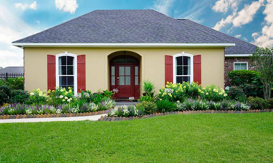
When choosing colors, select options that won’t clash with permanent home features like:
The best feature colors are those that accentuate and coordinate these items. Try not to choose options that clash, such as pairing a green roof with blue siding colors. Rather, pair the green roof with neutral siding colors, like Window World’s Antique Parchment, Adobe Cream or Monterey Sand.
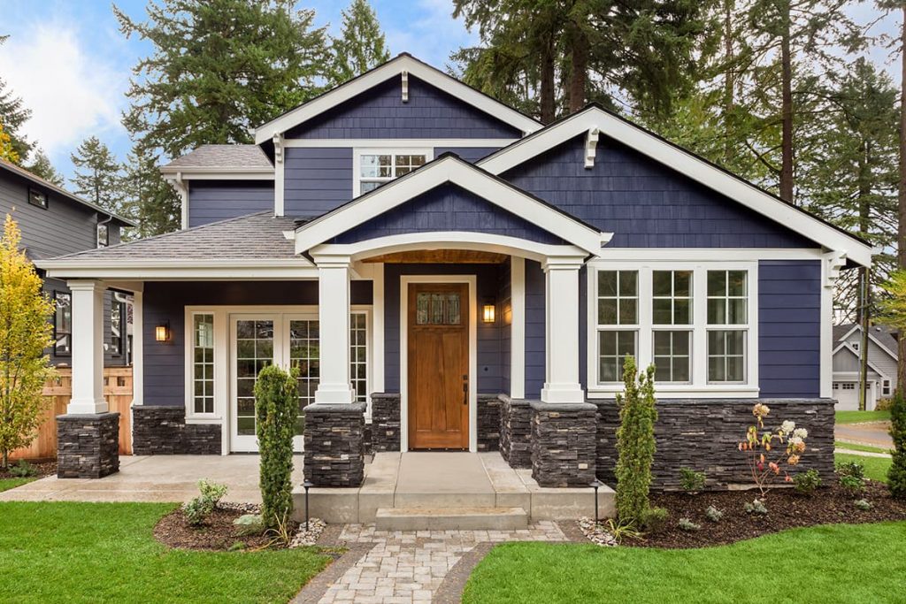
The average home needs two to four exterior colors for a balanced palette. Most stick with a three-color scheme: one for the body (siding), one for the trim (window frames) and one for the accents (shutters and front doors).
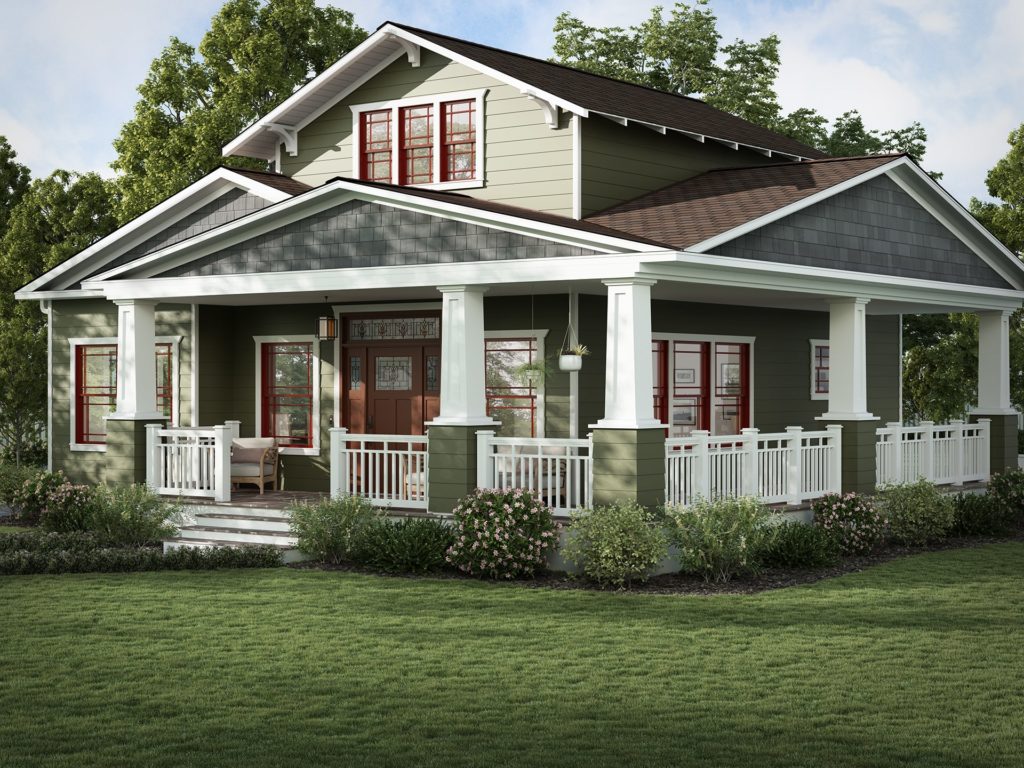
When creating your exterior color palette, remember the color wheel is just a starting point. Other elements might affect your color choices.
Every year, there’s a new home exterior design trend. Think carefully before you jump on the bandwagon.
Bright neon siding or dark siding with dark accent combinations might look trendy now, but what happens when they go out of style? You might be stuck with an expensive exterior design that no longer suits your tastes. Even worse, out-of-style trends can lower your home’s resale value (or force costly refinishing if you decide to list your property). It’s better to stick to lasting color combinations that keep your home looking its best.
If you’re ready to move from visualizing your home’s color palette to bringing your vision to life, Window World is ready to help. Our wide selection of windows, doors and vinyl siding comes in timeless colors that seamlessly complement one another and the natural landscape. By keeping color theory in mind alongside other design best practices, you’ll have a winning combination in no time.
Contact us for a free estimate on your next home upgrades.